Duval Triangles and Pentagons
The formulas that provide the outcome of the Duval Triangles and Pentagons can be combined with their visual representation using one of the charts provided by xDGA.
These charts are Excel Scatter Plot charts that are automatically formatted to represent either a Duval Triangle or a Pentagon.
These charts can be inserted in any Excel Worksheet.
How to insert a chart
There are six triangle and two pentagon charts available for insertion.
To insert a chart follow this steps:
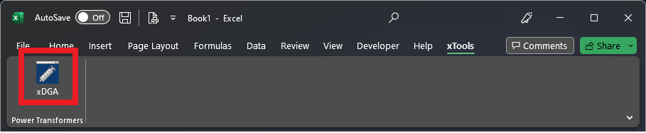
- If the task pane is not already displayed on your screen, click on the xDGA button under the xTools tab.
In the task pane, go to the Reports and Charts tab and click on the Select a chart .. drop down menu contained in the Duval Charts card.
This will present you with a list of the available charts that can be inserted in your worksheet. Each of the charts can include some relevant notes about their usage.
You can choose whether to include these notes using the Include notes toggle switch on top of the dropdown.
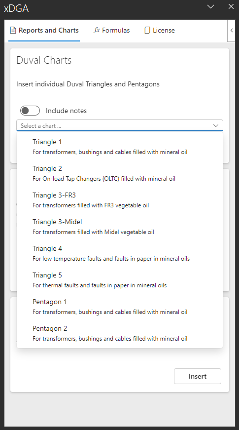
- Once you have selected the chart you want to insert, click on the
Insertbutton

- The selected chart will be inserted in the current worksheet.
An additional worksheet will be inserted in the workbook.
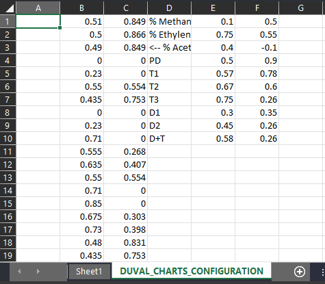
This worksheet (DUVAL_CHARTS_CONFIGURATION) contains configuration data for the areas and labels of the chart. It is inserted in a new tab in order to not interact with your existing data in any way. You can safely hide this worksheet and not worry about it.
If you add more charts later to the same workbook, their configurations will be stored on the same worksheet.
If you decide you don't need any of these charts and delete them from your workbook. You can safely delete this worksheet too after all charts have been removed.
How to insert DGA results data
To insert DGA data points, you need to insert regular X,Y data points to this chart.
We recommend to follow the next steps:
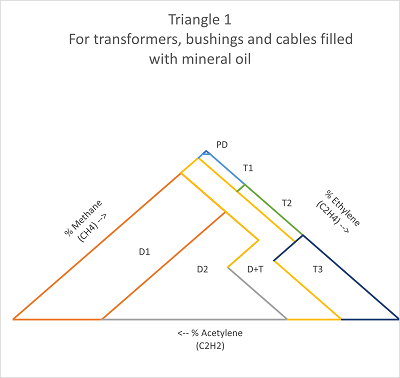
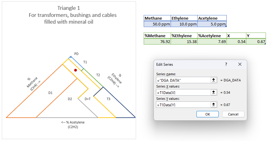
- Start with the range that contains the gases you would like to plot. In this example we are using Triangle 1, so we will use Methane, Ethylene and Acetylene.
![]()
- Next, convert these gas contents to a percentage of the total of the three.
=T1Gases[Methane]*100/SUM(T1Gases) =T1Gases[Ethylene]*100/SUM(T1Gases) =T1Gases[Acetylene]*100/SUM(T1Gases)
![]()
Next, use xDGA's TRIANGULAR_TO_CARTESIAN conversion formulas to get the X and Y coordinates of each data point.
Make sure that the leftAxis, rightAxis and bottomAxis inputs to the formulas correspond with the gases in the chart. In this case, %Methane is the leftAxis, %Ethylene is the rightAxis and %Acetylene is the bottomAxis.
=xDGA.TRIANGULAR_TO_CARTESIAN_X([@[%Methane]],[@[%Ethylene]],[@[%Acetylene]])
=xDGA.TRIANGULAR_TO_CARTESIAN_Y([@[%Methane]],[@[%Ethylene]],[@[%Acetylene]])
We suggest to add these coordinates as a couple of additional columns to your table with the percentages.
![]()
You now can simply add the new X and Y ranges on this table to plot the data points.
You can format this data points with standard Excel functionality to make it look exactly the way you want.
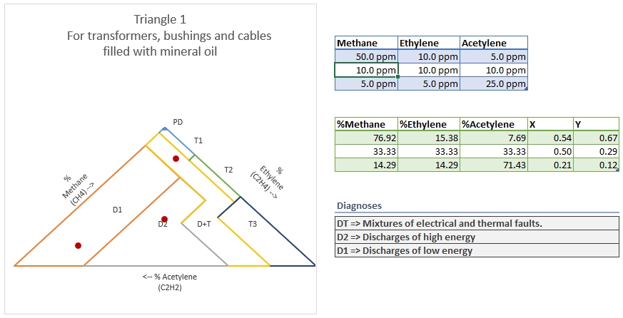
- For a more complete analysis, you can also use xDGA's DUVAL_TRIANGLE_ZONE formula to get the Zone of the triangle that each data point is located in.
Need an easier way?
These steps allow you to insert Duval charts in any spreadsheet and as many times as you want.
Whilst this provides you with the ultimate flexibility, you might want to start with a ready made template.
For this you can use our Report Template template which includes all these best practices and lets you get started right away.